|
10/30/2020 0 Comments TOC layouts
Works Cited:
https://www.canva.com/
0 Comments
10/23/2020 0 Comments Compare/contrastCompare notes & write ups*Any markings of (...) in the Cambridge notes or response are due to the fact I couldn't read those words because of the candidate's handwriting Compared to the Cambridge notes, I don't have the same terminology, but more notes overall. We both make mention of the use of lighting and the color of it, but with a different take on it. The best thing I can do is better understand editing terminology for the future and better format my write up as I was unsure how it should be done for this AICE exam; as the Cambridge write up and notes I am comparing my own work too did theirs in paragraph format per scene with plenty of comments by their grader that they had a great use of proper terminology throughout their response.
They however, described and detailed scenes my class wasn't given, meaning I'm not sure how close my assessment on some of the material may have been, which is a significant difference. Both of us focused more on camera and Mise-en-scène and sound than the editing, which I found slightly comforting. 10/23/2020 0 Comments Magazine Mockup #1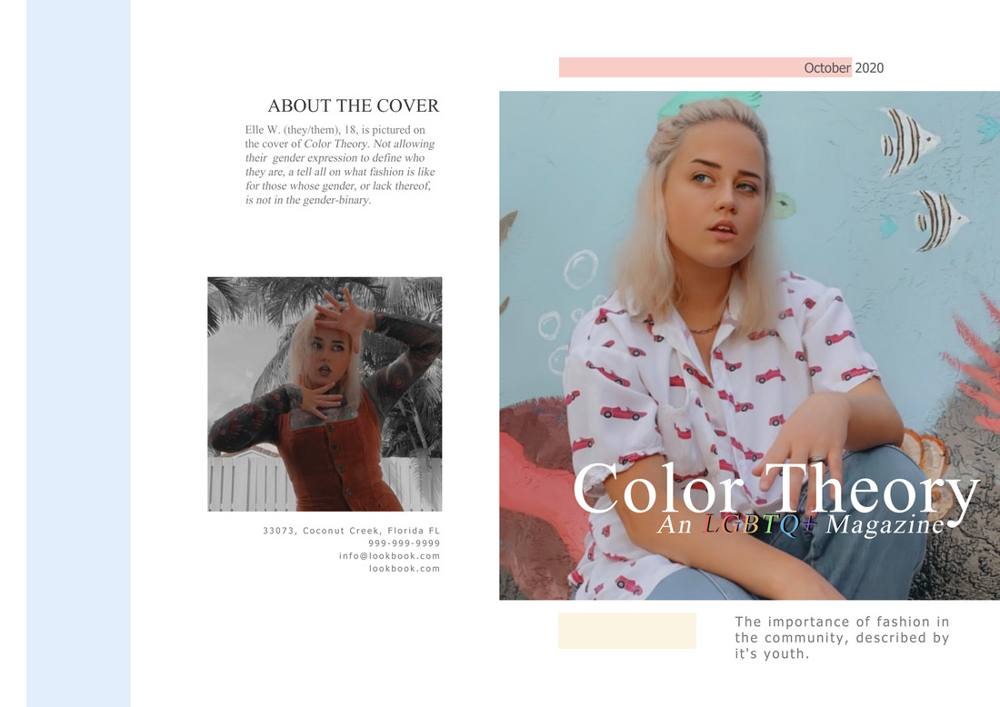 All photos were taken by me. Write Up:
Masthead: In a literal sense, "Color Theory" refers to a body of practical guidance to color mixing and the visual effects of a specific color combination. There are however other definitions of it based on the color wheel: primary color, secondary color, and tertiary color. I wanted the name to suggest the spectrum of identities that are in the LGBTQ+ community, while also applying to how colors are involved with the fashion process. Typography: By keeping most of the colors type colors neutral I wanted it to play into the colors of the cover photo, along with the secondary photo. With the "About the Cover" being a pastel shade of red, it plays into the warm tones of the model, Elle Weis, while also grabbing the viewers' attention. A similar thing was done with the strapline and masthead, with "LGBTQ+" being in color compared to the neutral whites of the rest of the cover, it acts as a way to get the attention of the viewer without being overbearing. So overall, it's easy on the eyes while also giving a more serious but youthful attitude. Image: The cover model for the mockup of Color Theory was my friend, Elle Weis. Both images were originally taken as full shots with natural lighting, aside from the grayscale edit on the secondary image. The primary cover photo has a more relaxed and natural pose, with their body turned towards the camera, but their head tilted to the left. With the direction their eyes go, it brings attention to the "About the cover" section, while their hands and body bring the eye to the masthead and strapline. In the primary cover photo, Elle is dressed in a more masculine way. Sporting a polo shirt, jeans, and a chain around their neck; while in the secondary photo, they dress more feminine with a corduroy dress with a space-themed turtleneck underneath. Language: As previously mentioned, the strapline includes the use of the acronym LGBTQ+, but it fully reads as "An LGBTQ+ Magazine," letting the readers know the overarching theme of the magazine's contents. There are no rhetorical questions present, as most of the focus is on the model themselves. |
AuthorI'm a High school student trying to learn to navigate and study the use and techniques behind Media, welcome to my journey. Archives
May 2021
Categories |
 RSS Feed
