|
9/28/2020 0 Comments A lesson in Intertextuality
Work Cited
12 June 2014, geekdad.com/2014/06/phineas-ferb-star-wars-premiere-july-26-feature-voices-colin-pegg-mythbusters/. 22 Aug. 2020, headtopics.com/ie/how-christopher-nolan-has-held-true-to-his-sweeping-vision-with-tenet-15149007. 7 May 2018, www.buzzfeed.com/audreyworboys/shrek-hidden-pop-culture-references. amazing-movietv-kisses.fandom.com/wiki/Kiss_between_Mary_Jane_Watson_and_Spider_Man. flipboard.com/article/obi-wan-kenobi-disney-series-reportedly-casting-a-young-luke-skywalker/f-a5f6377f84%2Fcomicbook.com. Oct. 2019, www.pinterest.com/pin/147704062767234577/.
0 Comments
9/16/2020 0 Comments Blog Entry: 9/16/2020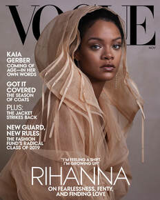 What can you tell about the type of magazine it is; what kinds of articles it contains; who is likely to read it? Why? Vogue Cover I will be using for this assessment is on the left. Information to acknowledge first: The visual elements, The figure that acts as the main interest of this magazine cover is Rihanna, she's wearing a warm, light weight light-brown jacket that frames her face and makes it so it's the focal point, not her body. The colors used in this magazine cover are nearly completely neutral, with the background having a colder hue beneath the gray, and Rihanna's clothing (and her own skin tone) having a warmer hue, bringing the attention to her immediately. The typography even plays into this, with the black font color of the title behind her, and the white text in front and around her, it gives another sense of depth while also maintaining a layout that will gauge viewer interest. Her pose is natural, putting the read at eye level with her, she's sitting casually, head turned to face the camera. Linguistic elements – Vogue, the name of the magazine is in all capital letters behind the main focus of the cover, Rihanna. Vogue itself has a reputation for being about fashion, and people who often make the covers of Vogue are more often than not important and influential, by using that connotation and placing Rihanna in front of the title- the symbol for Vogue- it gives her a sense of importance to the viewer. The 'teasers' are shaped around Rihanna, still leaving her as the main focus of the magazine cover. Lifestyle – A more fashionable lifestyle with a sense of fearlessness is being offered here by the use of teasers throughout the cover. Representation – Rihanna is placed in the center, taking over the Vogue title, with her name being displayed in a larger and different font than the teasers, it presenting her as someone important and powerful, despite her relaxed posture and body language. Mode of address – The audience would be drawn in. As previously mentioned, Rihanna is looking at the audience, it makes it feel more personal, a more personal approach with the addition of a quote from the interview within the article make it more promising, we're more inclined to trust people we know, it would make the audience want to read it more. Rhetoric – The reader is being persuaded to look into the article and to read what it has inside of it by getting their attention with a familiar and well adored celebrity. Along with the use of bolder/larger font sizes to get the reader's attention on what the content within the magazine is. Based on all of the information above, it could easily be said that the articles within revolve around fashion, and more specifically an article on Rihanna and her company, Fenty Beauty. People who are fans of Rihanna and those who like fashion and want to stay involved with the latest trends in the industry would read this magazine, as Vogue is a highly esteemed fashion magazine that covers the industry at large, and as it contains an article focused on Rihanna there is a good chance that her fans would read it just for her. Work cited:
in.pinterest.com/pin/399483429450206648/. |
AuthorI'm a High school student trying to learn to navigate and study the use and techniques behind Media, welcome to my journey. Archives
May 2021
Categories |

 RSS Feed
